

Every year, various players in the design industry showcase their predictions for what color palettes are going to be trending in the upcoming year. As designers, these predictions are always something to look forward to. We enjoy those predictions so much, in fact, that we decided to come up with our own color palette of the year for 2026. However, we wanted to pull our inspiration from our work this past year: the designs we brought to life, the materials we work with every day, and the creative influences that surround us.
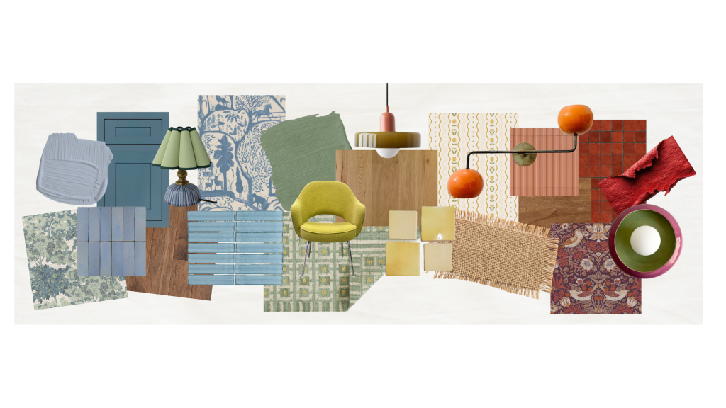
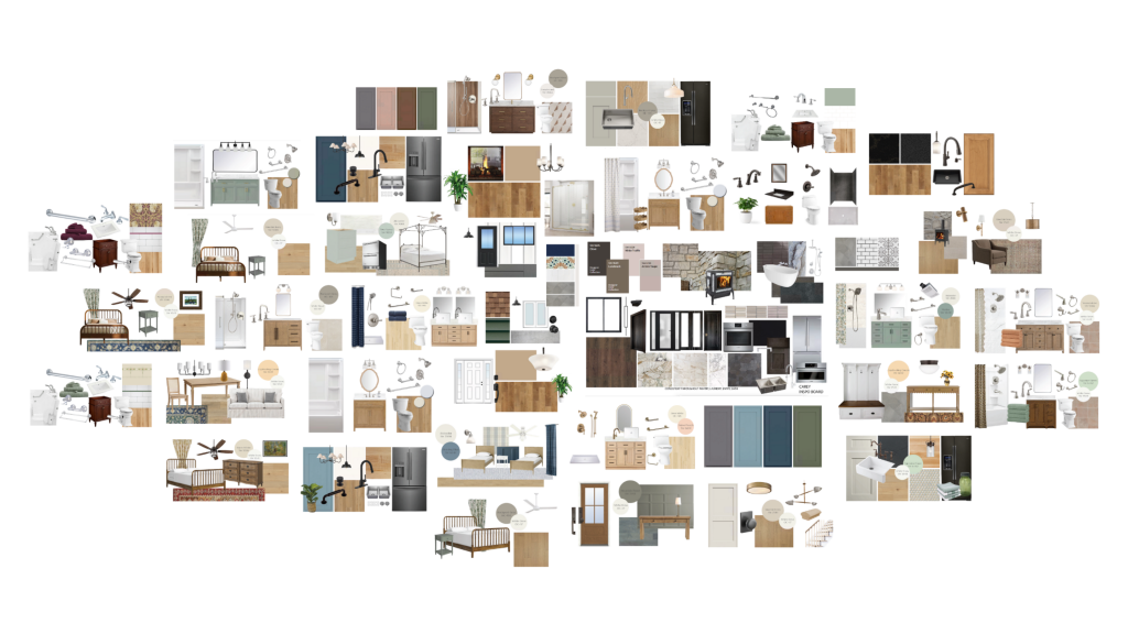
So we compiled all of our design presentations into one big collage, and we noticed ourselves not only building a strong design identity, but also the way the color palette brought in a rich personality to these refreshed spaces. Now let’s get into the palette we’ve been inspired to create.
Creating the Color Palette
This color palette started with a collage and pointing out the patterns we saw.
As we reviewed our designs from the past year, a few themes kept popping up:
- Warm woods and natural finishes
- Nods to historical elements & craftsmanship
- Spaces that feel layered and cozy, not just fresh and brand new
- Intentional and modest usage of color
With all of the ‘color of the year’ predictions rolling out, we noticed similar patterns in the fashion and interior design trend forecasts we were seeing. The embracement of richer hues, such as pistachio green, sunkissed yellows, deep plums, earthy reds, and refreshing blues were showing up in both clothing and home decor and everywhere in between. Any of these colors could bring expression and joy into a design, while still keeping its intended composition.
Instead of looking at bold “pops of color” or a statement wall, this year we’re finding ourselves drawn to colors that feel like they belong in a well-loved home; a home with a story. We’re bringing in hues that reference historical context, the beautiful northern nature that surrounds us, and craftsmanship.
Why These Colors Feel Right for Us
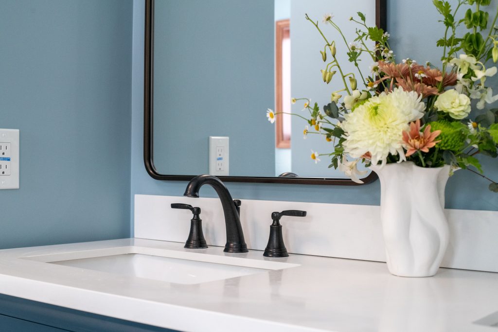
The designers of Carey Design Build have always gravitated toward homes with character. We love when we encounter a house with history, even if it’s recent history! Historically, many homes weren’t simply neutral boxes. Color was used thoughtfully on trim, doors, cabinetry, built-ins, and walls, and it added both warmth and identity to each space.
This palette reflects that sensibility. Each color feels:
- Approachable and intriguing, but not intimidating.
- Expressive, but not overpowering a space.
- Rooted in history, with a modern incorporation.
These are colors that work beautifully alongside wood floors, stone, brick, and traditional millwork, which are the materials that define so much of our work at Carey Design Build.
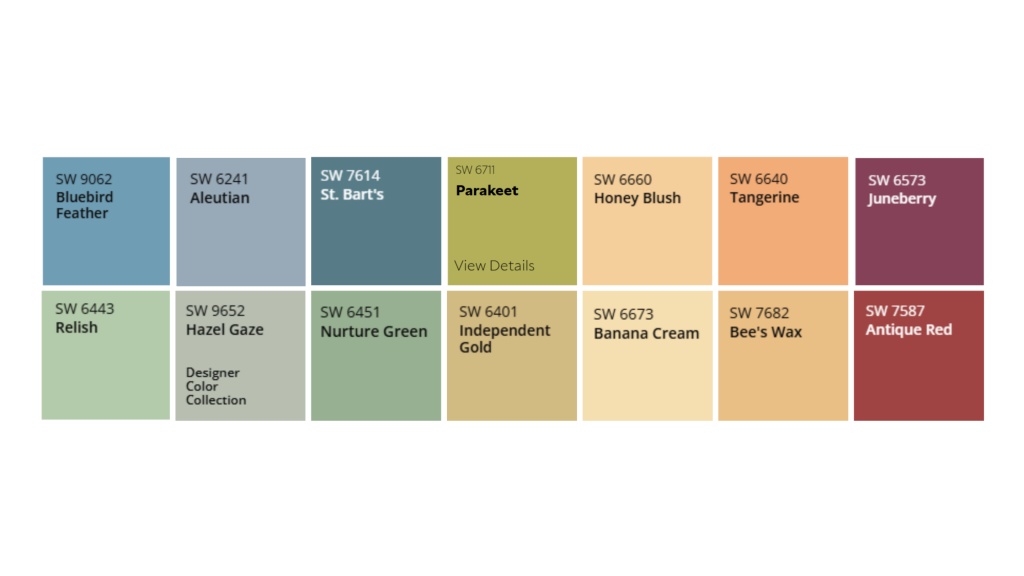
Our 2026 Color Palette
Below is the color palette inspiring us this year. Rather than selecting a single ‘color of the year,’ we’ll be referring to this palette as a way to align ourselves with the direction we’re heading.
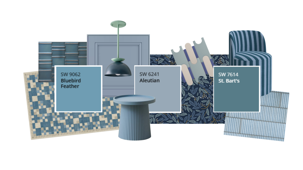
Refreshing Blues
- Bluebird Feather – SW 9062
- Aleutian – SW 6241
- St. Bart’s – 7614
The blues in our color palette feel joyful and optimistic. They bring the respite, clarity, and freshness of Upper Peninsula summers without feeling coastal or overly cool-toned.
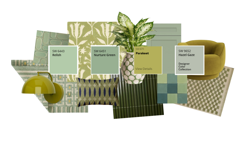
Expressive Greens
- Relish – SW 6443
- Nurture Green – SW 6451
- Parakeet – SW 6711
- Hazel Gaze – SW 9652
From soft greens to vibrant chartreuse “pistachio” tones, these colors are inspired by the nature of spring. Nothing makes a statement quite like chartreuse.
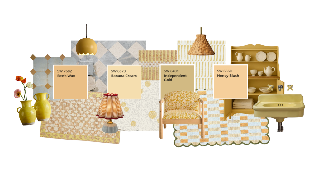
Sunkissed Yellows
- Banana Cream – SW 7682
- Bee’s Wax – SW 6673
- Independent Gold – SW 6401
- Honey Blush – SW 6660
These yellows add a kiss of sunlight to our palette – warm, welcoming, and full of energy. They add brightness to a chilly northern winter without tipping into harsh or artificial territory.
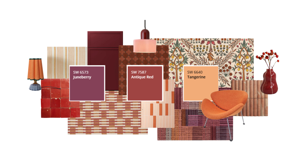
Opulent Accents
- Juneberry – SW 6573
- Antique Red – SW 7587
Tangerine – SW 6640
The strategic placement of these deeper hues incorporates both contrast and personality. While they may not be the choice for every wall, they’ll help weave some creativity into a space and bring something unexpected to the table.
Color as Part of the Design Story
For us, color isn’t about following a specific rule of design, it’s about supporting the story of a home. How does a space make you feel? This color palette is the result of a phenomenon we’ve been paying attention to and cheering on. Design is, yet again, stepping away from playing it safe with white and gray boxes. We as humans are craving tactile, layered experiences and spaces that feel lived-in.
Whether color shows up in cabinetry, a powder room, a front door, or a subtle accent, we see it as an opportunity to add a sense of individuality.
The Color Palette Through the Year
This color palette will continue to show up for us as designers as the year plays out. Some of these hues may show up more than others in our projects, and some may only remain part of our creative process, continuing to inspire how we think about contrast, warmth, and personality in each and every home we design.
This palette represents where we’re headed for 2026: embracing intentional color, celebrating your unique home, and showcasing how spaces make us feel.
Which color from this palette would you choose as your 2026 Color of the Year?
Written by Mickayla Crandall | Published January 30, 2026